Reimagining a RegTech Case Workflow

Creating a streamlined experience and more configurable interface to meet client needs

Rendering of a laptop computer seen from an angle. The screen shows a business application.

Company: Opus
Role: UI/UX design
Year: 2018–2019

Context

After years of continuous development, the product had become bloated with a bad user experience. Additionally, after an acquisition, the company had rebranded. We embarked on an overhaul of the product’s front end, improving the user experience and updating the branding.

Challenges

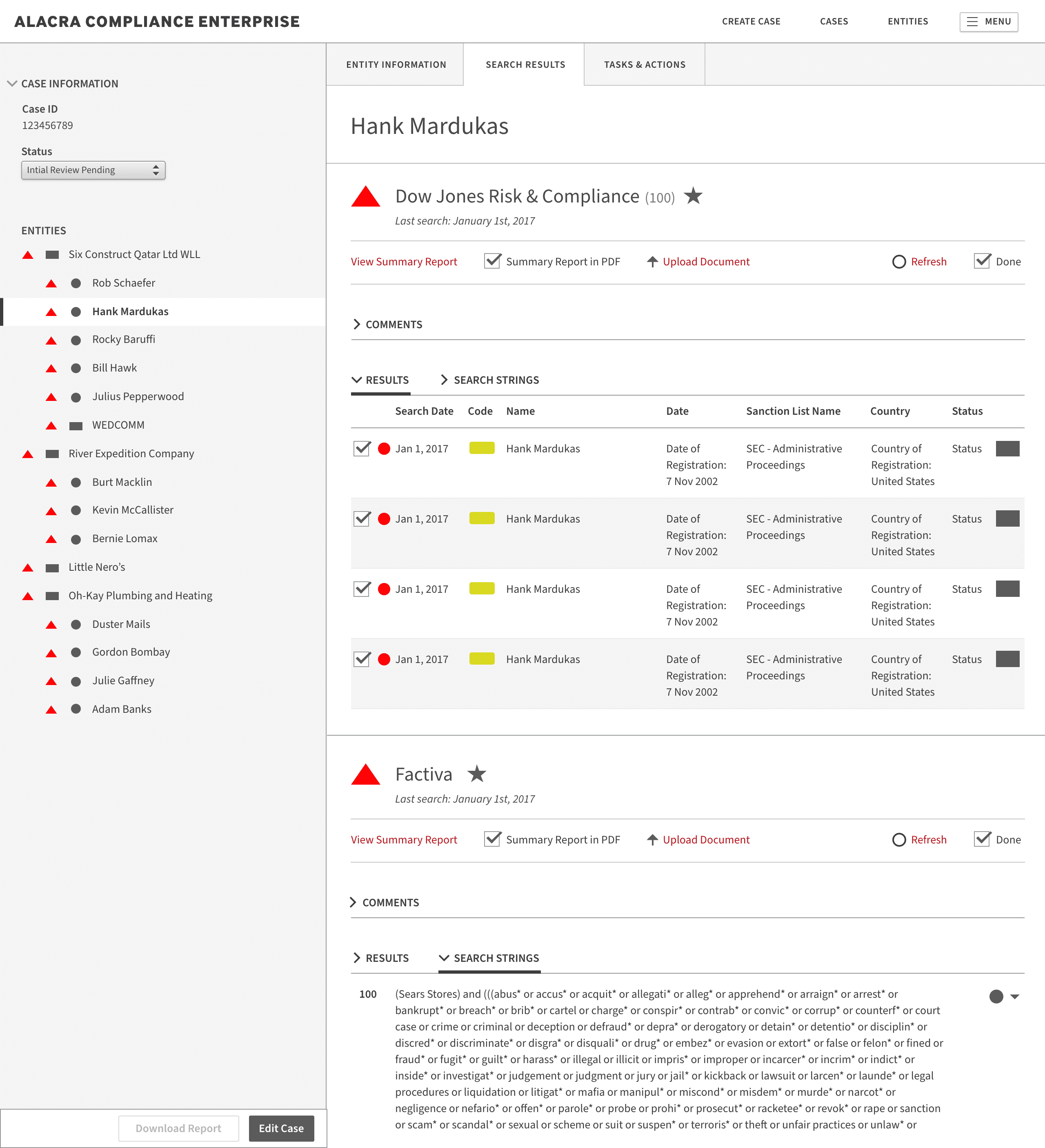
The single column layout was designed and implemented before multiple-entity case functionality was added. This caused users to constantly have to scroll back to the top of the page to select a different entity in the case. The number of input fields varied by client, which created spacing issues. Additionally, the product was originally created before responsive design became a table-stakes feature; therefore, it was hard-coded to be 1024px wide.

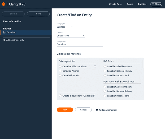
The long, overwhelming screen that clients struggled to navigate due to the need to constantly scroll up and down.
A screenshot of an overly complex, badly designed user interface. It is a very long and confusing page.

Early wireframes explored an expandable section for comments. The final design uses a modal with a rich text editor and displays previously entered comments.

A wireframe showing a left sidebar showing a list of people and companies with one of the items selected. The main content area has 2 columns of data entry fields for business information.
A wireframe showing a left sidebar showing a list of people and companies with one of the items selected. The main content area has search results for numerous data sources.
A wireframe showing a left sidebar showing a list of people and companies with one of the items selected. The main content area has text areas for comments.

Feedback we received on early high fidelity mockups indicated that the horizontal blue bar was distracting. It also felt less sophisticated than we wanted. The light blue background was found to not be visible on the monitors that come with many enterprise-grade PCs.
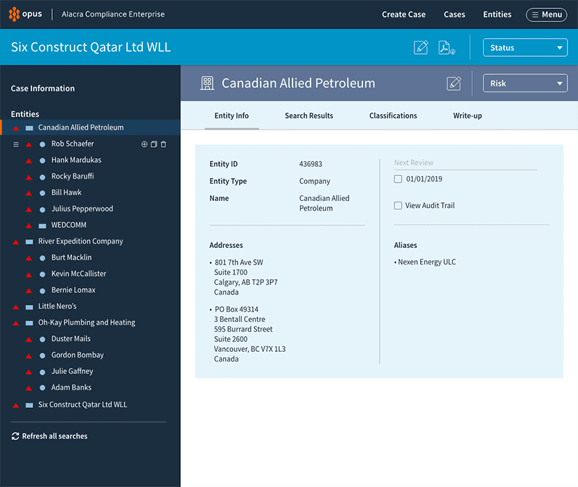
A high fidelity user interface mockup showing business information for a company named "Canadian Allied Petroleum.”
A high fidelity user interface mockup showing search results for a company named "Canadian Allied Petroleum.”

Solution

A screenshot of the first step of the final iteration. The image shows an empty sidebar and the main content area has data entry fields for basic case information.
A screenshot of the second step of the final iteration. The image shows an sidebar with one entry and the main content area has an entity matching function for the user to create a new entity or import information from an external database.
A screenshot of the third step of the final iteration. The image shows an sidebar with one entry and the main content area has empty data entry fields for the newly created entity, Canadian Allied Petroleum.
A screenshot of the third step of the final iteration. The image shows an sidebar with one entry and the main content area has filled data entry fields for the newly created entity, Canadian Allied Petroleum.

© 2024 Steve Blanco

© 2024 Steve Blanco

© 2024 Steve Blanco