Bringing a B2B SaaS UI into the 21st Century
How we modernized a dated UI to feel like an advanced GRC application

Company: SAI360
Role: UI design
Year: 2022–23
Context
When I joined the company, the application had two themes users could choose from, both of which felt dated. In addition to choosing a theme, clients could add custom branding including a logo and brand colors.
Challenges
Because of tech debt, having two themes required double the design and development work. Additionally, sales were sagging. Prospective clients did not believe that a product that looked this dated could be technologically advanced enough to fulfill their needs.
Solution
Once constraints were defined, I began designing. I proposed removing the concept of themes, allowing us to have a single, consistent UI as well as streamlining the design and development process.
As a B2B SaaS product in the healthcare space, the UI didn’t need to feel revolutionary as much as modern and in line with current styles. Warmth and visual interest were added by increasing the border radius and softening the shadows.
The two icon sets, pixel-based illustrative icons and an outline set not well suited for display at 16px, were replaced with simpler and clearer icons from the Phosphor icon set.
OLD

NEW
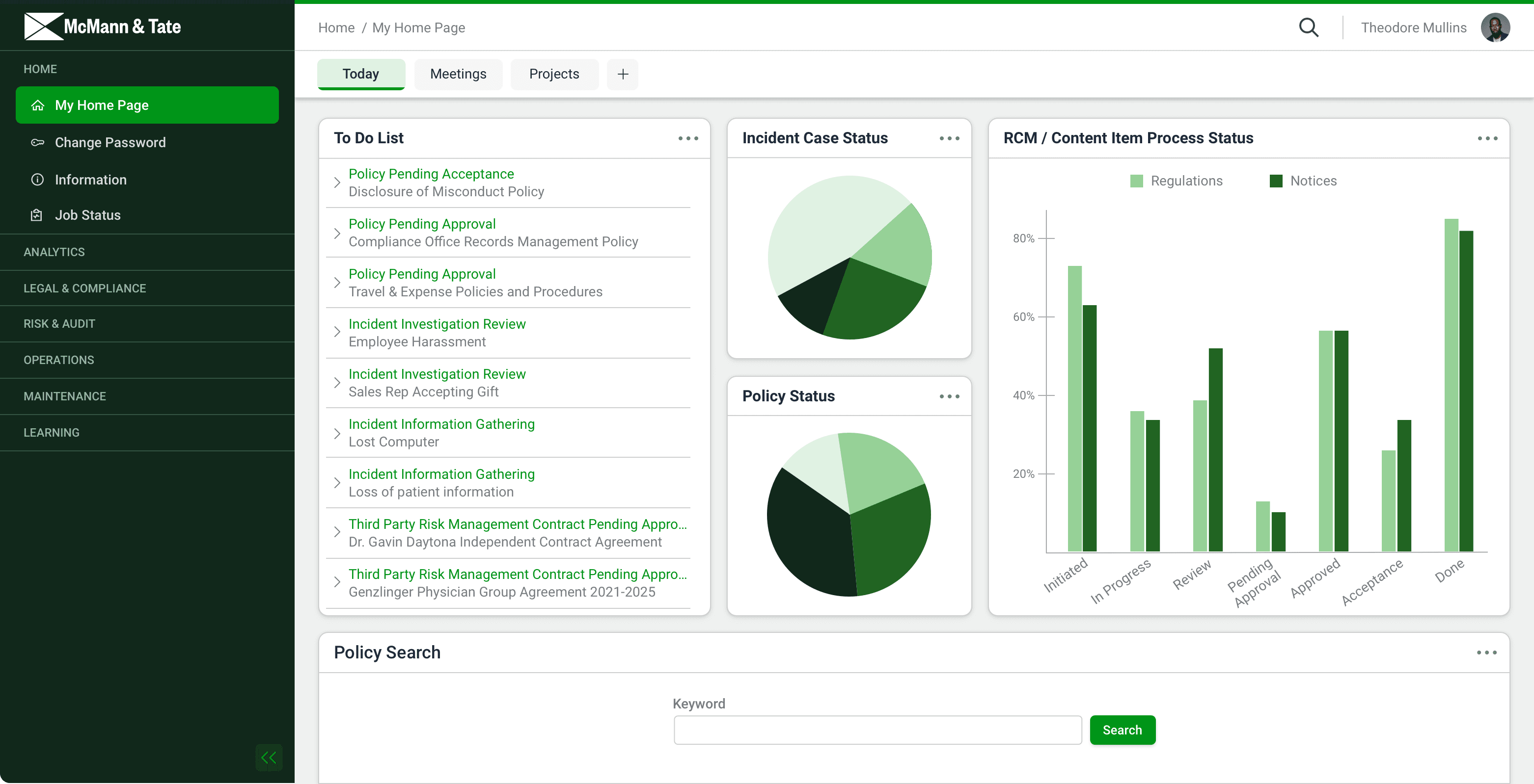
In addition to these foundational changes, the decision was made to double-down on client branding. Instead of simply applying the client’s single brand color to tabs, primary buttons and H1 tags, we could convert the hex code into the HSB color model and apply the hue to different UI elements. This not only provides a distinct style but also helps users feel more at home in an application that many do not realize is different from their internal systems.