
Streamlining an Expense Review Workflow
Using user insights to create a faster, more focused review experience

Company: StarCompliance
Role: UI/UX design
Year: 2025
Context
Expense Tracking is a new product designed to simplify how compliance officers review employee expenses related to gifts and hospitality. Expenses are imported from an external system and run through a matching process that compares them against employee declarations. Compliance officers review expenses where the match has a low confidence score or where another issue requires their attention. I worked closely with the Product Manager to develop a streamlined experience for reviewing and resolving these expenses.
Challenges
Compliance officers needed to review expenses that required attention, but user research showed that they preferred to work through one expense status at a time. This created a challenge around designing a workflow that allowed users to quickly move through a focused set of expenses without losing access to the information needed to make a decision. The experience also needed to accommodate a significant amount of expense data without making the review process feel overwhelming. The challenge was to create a focused, efficient review experience that balanced speed with the complexity of the information users needed to evaluate each expense.
Solution
Based on the research, I organized the experience around the way compliance officers preferred to work: focusing on one expense status at a time. I used tabs to separate the different statuses, allowing users to concentrate on a specific group of expenses rather than reviewing everything together.

The research also showed that the initial review of an expense was typically quick. To support this, I used a drawer that allowed users to review an expense while keeping the list and their place within it visible. After completing an action, the next expense automatically opened in the drawer, allowing users to rapidly work through the list with fewer clicks and without repeatedly navigating between expenses. The page provided a focused list of work, while the drawer supported quick, continuous review of individual expenses.
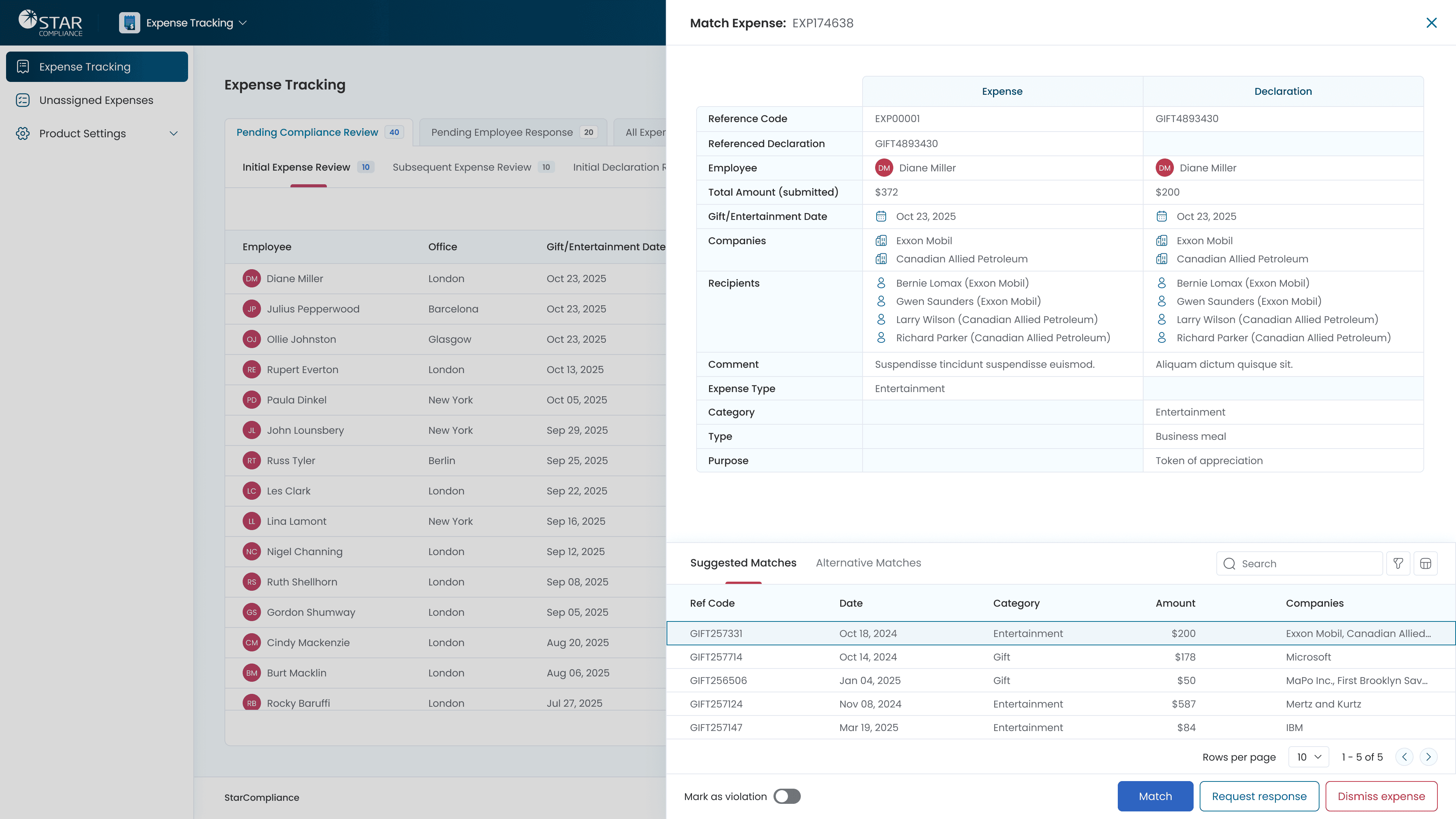
The research also showed that the initial review of an expense was typically quick. To support this, I used a drawer that allowed users to review an expense while keeping the list and their place within it visible. After completing an action, the next expense automatically opened in the drawer, allowing users to rapidly work through the list with fewer clicks and without repeatedly navigating between expenses. The page provided a focused list of work, while the drawer supported quick, continuous review of individual expenses.

Together, these decisions created a workflow that allowed compliance officers to focus on one status, quickly work through expenses, and access the detailed information needed to make a decision without losing their place.
